

This article will explain how to change breakpoints in Elementor. In this day and age, it is of the utmost importance to create a website tailor-made for each device. In just one year, desktop internet usage dropped from 54.86% to 48.88%, while mobile users share marked an increase from 37.38% to 47.59% in 2021. Thus, it is imperative to design your website according to the latest trends in internet usage. Nowadays, new devices are released almost daily and screen sizes differ from one device to another. Consequently, creating custom breakpoints has never been as important as it is now. Thankfully, one of the best (if not the best) WordPress page-builder plugins Elementor has successfully implemented custom breakpoints into its design.
What is a Breakpoint?
Let us take a step back and discuss what is a breakpoint. A breakpoint is a predefined pixel value within whose limits the content and design of the website will change its layout. In essence, breakpoints are used to adjust the layout for specific screen sizes in order to provide the user with the best possible experience. For instance, if your website’s header on desktop displays 5 navigation menu items, then on mobile the navigation bar will be cluttered and navigation items might overlap each other. By applying a particular design for a specific breakpoint this issue can be easily remedied. It is a delight, that by using Elementor we can change the breakpoints and their respective designs with a few clicks of a button.
/* For extremely small screen devices (595px and below) */
@media only screen and (max-width: 595px) {…}
/* Small screen devices (600px and above) */
@media only screen and (min-width: 600px) {…}
/* Medium screen devices (768px and above) */
@media only screen and (min-width: 768px) {…}
/* Big screen devices (889px and above) */
@media only screen and (min-width: 889px) {…}
/* Extra big screen devices (1200px and above) */
@media only screen and (min-width: 1200px) {…}
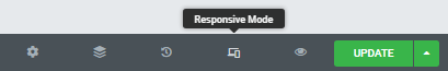
Responsive Mode and Breakpoints in Elementor
Elementor has graced us with the responsive mode, clearly and coherently implemented within its design. The features are numerous and incredibly handy for a web developer or designer. Let us take a look at them one by one.
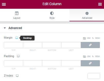
Most of the elements employ some sort of numerical value. It could be text size, margin, padding, etc. These values have a viewport icon next to them. By clicking on the icon, we can choose the device and then apply the desired value to it.
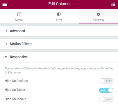
You might want to display a particular section or a piece of content on one device, but hide it on another. Elementor has provided us with a setting specifically created for this action. You can choose after which breakpoint the section will be hidden and where it will be shown. An incredibly useful feature as it eliminates the need for applying custom code to your website.
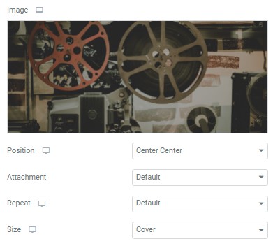
Background images in Elementor are automatically device-responsive, but responsive mode allows us to customize them even further. You can even change the background image altogether for different devices. Image position, attachment, repeat, and size can be designed according to your specifications for any breakpoint you have set.
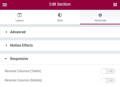
Another useful feature is “Reverse Columns”. For devices with small screen sizes, this feature comes in handy.
Keep in mind that you cannot delete an element in one mode, for instance, mobile, and expect that it will still appear in other modes. Deleting an element will erase it across all devices. In the same manner, you cannot move around sections and hope that they will keep the same layout on other devices. Consequently, it is important to note that, if the element does not have a viewport icon next to it, then the changes you have applied will be displayed on all devices.
Changing Breakpoints in Elementor
Now that you have located the Responsive Mode menu and are well aware of its functions, you might have decided that the 3 in-built breakpoint options are not enough for you. In all honesty, it was probably the main reason why you looked up this article. With the introduction of Elementor 3.4, additional breakpoints can be added and their values customized based on the design of your website. Now, up to 7 breakpoints can be chosen, including the default desktop breakpoint. Let us guide you through a step-by-step breakpoint guide.
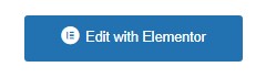
1. Go to the WordPress dashboard and choose any page. Afterward, click Edit with Elementor.
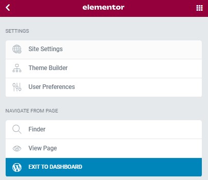
2. In the upper left corner locate the Elementor settings icon (an icon with 3 horizontal lines) and click on it.

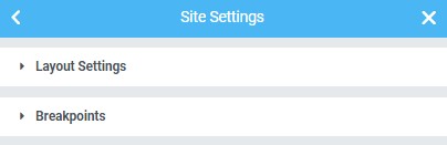
3. Now click on the “Site Settings” button.
4. Locate the “Layout” button.
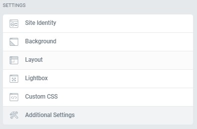
5. You will be presented with 2 options “Layout Settings” and “Breakpoints”. Choose “Breakpoints”.
6. In the “Active Breakpoints” window, click on the plus sign icon “+” and pick the additional breakpoint that suits your needs. You can enter custom values for each breakpoint
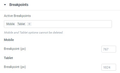
Keep in mind that Elementor uses a cascading concept across breakpoints, which means that changes cascade down. The changes that you will make on a larger breakpoint will cascade down to the smaller ones, but they will not work vice versa. The only exception is the Widescreen breakpoint. In this case, Elementor will cascade up and use the desktop breakpoint as the default.
The Success of Elementor 3.4
The Elementor team has done a tremendous job by implementing custom breakpoints within their design. In the past, additional breakpoints could only be added by writing a custom code within the functions.php file. Consequently, most beginners in WordPress development were unable to change these breakpoints due to a lack of knowledge in coding. Not to mention that by tinkering with files like functions.php, we can render our site inaccessible and in the worst-case scenario delete it or lock ourselves out of it. Thankfully, Elementor has solved this issue with astounding success.

At its inception, Elementor was designed with 2 breakpoints in mind. In order to add supplementary plugins, they had to make fundamental changes in a wide range of places in the codebase. The addition of such vast changes to the codebase, if not done carefully, could have broken a lot of existing sites. And even if done correctly, could have slowed down the performance significantly. But an elegant solution was found and as a result, the server response time was improved by up to 23%, and the memory usage was reduced by approximately 5%. They also managed to save around 30% off of data traffic to the Editor load.
Final Words
With the introduction of Elementor 3.4, you can add additional breakpoints without applying custom code to your website. A user with no experience in coding can design websites for every type of device and even assign custom breakpoints. Even a senior web developer is highly appreciative of this feature, as it eases the workload of a project and improves the performance of a website. We hope that this small tutorial has provided you with the insight necessary for implementing custom breakpoints in Elementor. Stay tuned for more articles, cheers!